How to Follow Design Trends Without Letting Them Swallow Your Brand Whole
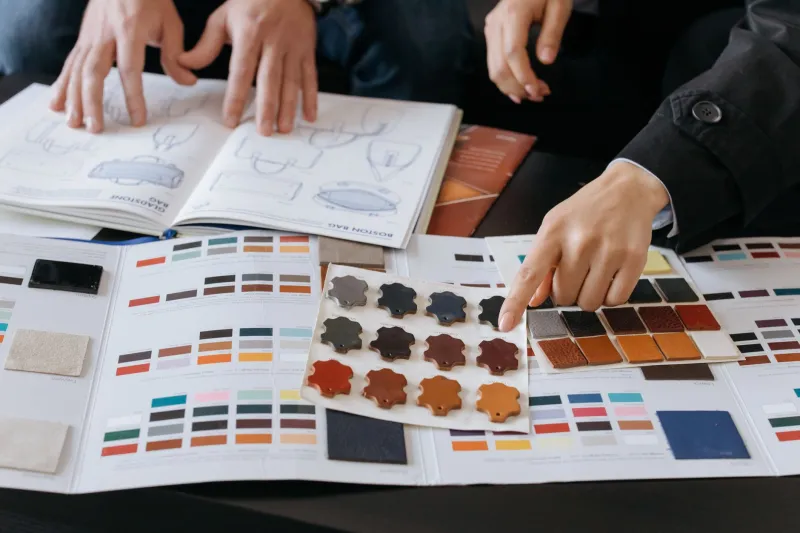
Design trends move fast. Like, uncomfortably fast.
One year, everyone's using soft gradients and rounded everything. The next, it's brutalist layouts and high-contrast type. Brands that went all-in on one aesthetic suddenly look like they were built during a very specific moment in internet history — and not in a charming, vintage kind of way.
The pressure to stay current is real. Customers do notice when a brand looks dated. But the brands that constantly overhaul their look to chase the next visual wave end up with a different problem: nobody can quite remember who they are or what they stand for.
So how do you stay fresh without becoming irrelevant the moment the trend moves on?
Not All Design Elements Are Created Equal
The first thing worth understanding is that your brand's visual identity isn't a monolith. It's a system — and different parts of that system have different jobs.
Some elements are load-bearing. Your core logo, your primary color palette, your typography choices — these are the things that build recognition over time. They're what customers use to identify you in a crowded feed or on a store shelf. Changing them has real costs, because recognition is something you earn slowly and lose quickly.
Other elements are expressive. The way you compose photos. The illustration style you use in social content. The motion design on your website. The visual language of your ad campaigns. These are the parts of your brand that have more room to flex — they can evolve with the times without dismantling what makes you recognizable.
When brands get into trouble with trends, it's usually because they're treating expressive elements like they're load-bearing, or vice versa. They either refuse to update anything (and end up looking fossilized) or they chase every visual trend all the way down to their core identity (and end up looking like they have no idea who they are).
The Brands That Got This Right
Take a look at how Nike has handled this over the decades. The Swoosh hasn't meaningfully changed since the 1970s. The wordmark is essentially unchanged. But the way Nike expresses that identity — through campaign aesthetics, photography direction, color use, and digital design — has shifted constantly. They've moved through minimalism, maximalism, streetwear influence, and everything in between, all without ever making you forget you're looking at Nike.
That's not an accident. It's a deliberate separation between the anchored elements of the brand and the expressive ones.
On the flip side, consider what happened with Gap's infamous 2010 logo redesign. After 20 years with a recognizable identity, they swapped to a generic Helvetica wordmark with a floating gradient square — chasing a cleaner, more "modern" look. The backlash was swift and brutal, and they reversed course within a week. The lesson wasn't that the old logo was perfect. It was that the brand equity stored in that familiar identity was worth far more than whatever trendiness they were hoping to signal.
A Framework for Deciding What Flexes and What Stays
Here's a practical way to think about your own brand's elements:
Anchor elements — protect these These are the things that carry your brand's recognition and trust. Your primary logo. Your core color palette (especially your most distinctive color, if you have one). Your primary typeface. The foundational tone of your voice. These can be refined over time, but radical changes should only happen when there's a genuine strategic reason — not because a design trend made them feel stale.
Expressive elements — let these breathe These are the things that bring your brand to life in context. Campaign visual styles. Social content aesthetics. Illustration and iconography approaches. Photography direction. Motion and animation language. These are where you can and should respond to the visual culture around you. Keeping these current signals that your brand is alive and paying attention — without sacrificing what makes it recognizable.
The test question: If you removed your logo from this element, would it still feel like your brand? If yes, it's expressive and has room to evolve. If no, you're in anchor territory and should move carefully.
Trend Fluency vs. Trend Dependence
There's a meaningful difference between a brand that's fluent in design trends and one that's dependent on them.
Trend-fluent brands understand what's happening visually in their space and find ways to nod to it through their expressive elements — without making those trends the foundation of their identity. They look current because they're engaged with visual culture, not because they've rebuilt themselves around a passing aesthetic.
Trend-dependent brands, on the other hand, can't hold a consistent visual identity because they're constantly chasing the next thing. They look fresh for about eighteen months, then dated for the next five years. And because they've never built recognition through consistency, customers have nothing to hold onto when the look changes again.
The goal is fluency. And fluency requires knowing what you actually stand for — because that's what stays stable while everything else moves around it.
Practical Ways to Stay Current Without Overcommitting
If you want to keep your brand visually alive without constantly restarting the recognition clock, a few habits help:
Run annual expression audits, not annual rebrands. Once a year, look at your expressive elements — your social aesthetic, your campaign style, your content visuals — and ask if they still feel current. Refresh what needs refreshing without touching the anchors.
Watch your category, not just design media. The trends that matter most to your brand are the ones your specific customers are responding to, not the ones winning awards on design blogs. Pay attention to what's working visually for brands in your space.
Make small, intentional moves. You don't have to overhaul everything at once to signal freshness. Updating your photography direction or adding a new expressive color to your palette for a campaign can do a lot without disrupting recognition.
Document what's intentional. One of the biggest reasons brands drift is that nobody wrote down which elements are anchors and which are flexible. Put it in your brand guidelines. Make the distinction explicit so that future decisions — whether made by your team or an outside agency — start from a shared understanding.
Staying Current Is a Practice, Not a Project
The brands that age best aren't the ones that reinvented themselves every few years to stay relevant. They're the ones that treated visual evolution as an ongoing, intentional practice rather than a periodic crisis to solve.
That means staying curious about what's happening in design culture, being honest about which parts of your brand are earning their keep and which ones are coasting, and having the discipline to flex where it's appropriate without unraveling what you've built.
Trends will keep coming. Your job isn't to resist them or surrender to them — it's to know yourself well enough to decide which ones are worth engaging with.